Emi Knight

JLL Portal


This project is a real estate prototype for brokers & clients; I led the visual design for the project.

 
iphonex-clay-mockup copy 5.png


Context

In 2015, JLL, a commercial real estate company hired our team to design a solution for brokers to be able to easily create and share real estate listings with their clients. The team consisted of 1 UX/UI designer (me), 1 UX researcher/designer, 1 product manager, 5 engineers, and 3 key client stakeholders. The project’s name was “JLL Briefcase.


We kicked off the project by flying to Chicago to meet with the clients.

 
IMG_20151118_095016 copy.png


Project kickoff

Myself, another designer, and the PM flew from Dallas to Chicago and did a 3 day sprint to onboard to the project. The JLL team already had a solution in mind and had built a simple prototype to show us.


The problem

The current process for brokers and admins pulling listings and showing them to clients was manual and time consuming. It was difficult for them to collaborate, wasting time and money for the company.

 
IMG_20151118_095016 copy 3.png
 
 
IMG_20151118_095016 copy 4.png


Client needs

Clients voiced wanting the ability to view property listings digitally on their phones rather than in a printed binder.


Brokers & admin needs

Brokers and admins wanted an easier way to collaborate and send their clients digital listings.

 
IMG_20151118_095016 copy 2.png


I collaborated with 1 designer, the PM and our clients on the interaction design.


1.png
 

Product goal

The goal was to create a prototype for beta testing: a responsive web app that works across desktop, tablet, and mobile. We wanted to optimize for mobile for clients and tablets for brokers.


Client portal site architecture

The client portal was focused on presenting available property listings in a clear way as well as providing the ability for clients to add requirements.


1 Client.png


Broker portal site architecture

After we ran a survey with JLL brokers for feature prioritization, we were able to better understand that brokers and admins needed the ability to easily collaborate and add listings for their clients.

 
broker.png


Wireframed key client user journeys

The key user journeys for clients included logging in, viewing details for a listing, liking a listing, and adding comments about a listing.


1.png


And broker & admin user journeys

Brokers key user journeys included creating a new briefcase, adding listings, and sharing the portal with their clients with a customized message.

 
1.png


And led the visual design framework, & worked with 5 engineers to implement it.


1.png


Colors

The colors were chosen to communicate a friendly, yet sleek and professional vibe of the real estate business. The red to help promote the JLL branding to the clients.


Type styles

Source Sans Pro is the official font that JLL uses for their public branding. Lato was a friendly, approachable, legible font.


1.png
 
 
1.png


Shapes

The design of the shapes was also used to communicate friendly yet professional.


Additional patterns

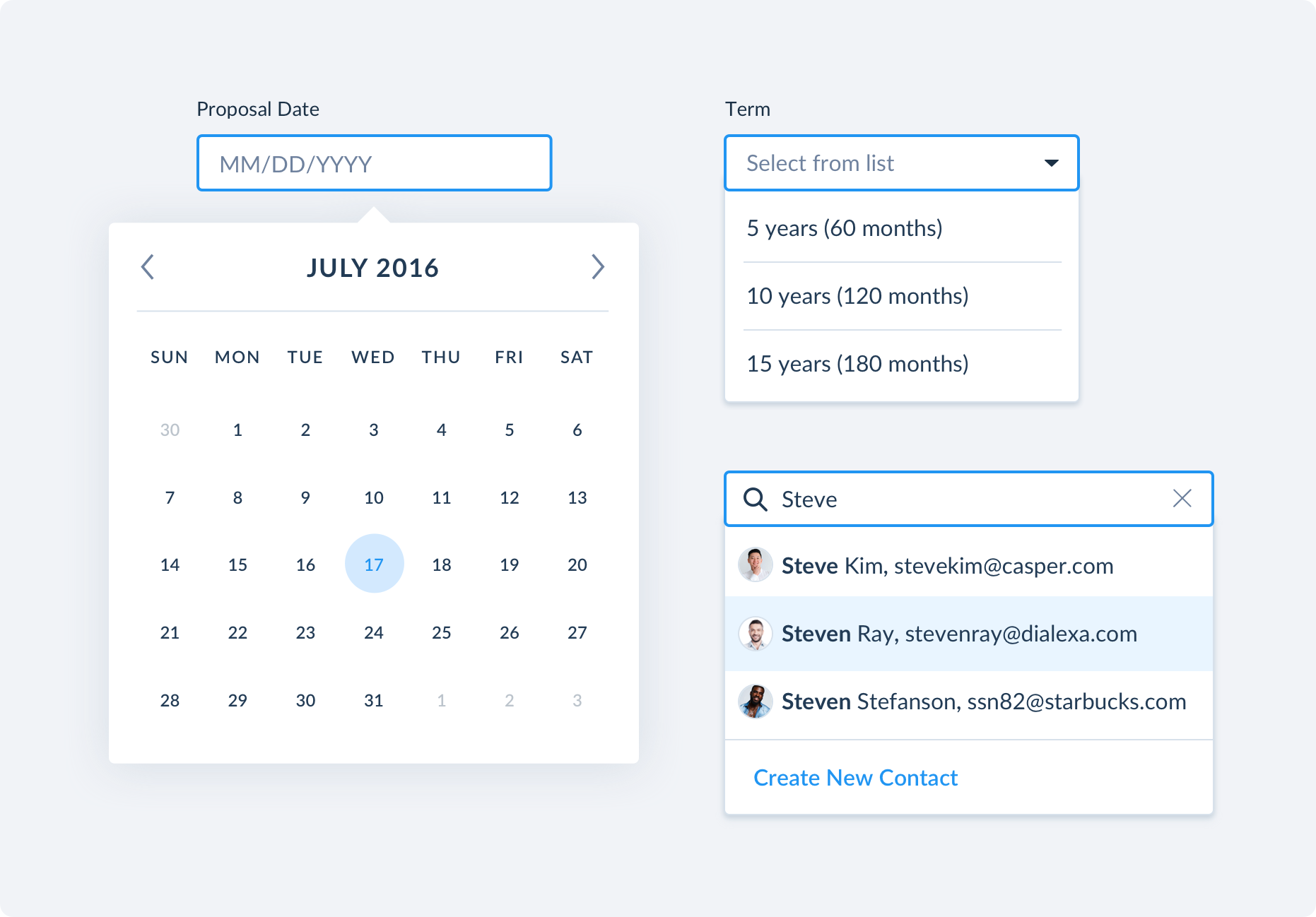
I created many patterns for the portal including calendar selections, dropdown menus, search bars, and more.

 
1.png


The final client portal

 
iphonex-clay-mockup copy 6.png
 
1 copy.png
 

View digital property listings

Clients were able to see real time property listings instead of outdated printed booklets. They could access them anytime from their pockets.


Add & read comments

Now there is one place that documents clear communication between brokers, and their clients. Previously things would get lost in emails and be difficult to connect back to the property listing.

 
boom.png
 
 
1 copy 4.png


Add & edit requirements

If things change, clients could easily change the requirements for the property. This way it’s crystal clear to everyone, and nothing gets lost in translation.


The final broker portal

 
iphonex-clay-mockup copy 7.png
 
 
test.png


Track client engagements

Organizing different client files was difficult for brokers and their admins previously - kept in word documents and scattered drive folders. Now they were able to easily see everything in one easy to understand space .


Collaborate with team members

Previously, when admins would help their brokers, communication would easily get confusing. Now brokers and their admins could easily work together and stay on the same page.

 
test copy 3.png
 
 
test copy 2.png


Share with clients

Out with the manually created, printed binder, and in with an easy to view, mobile friendly digital version with property listings.


Outcome

Overall, the client was very pleased with the design and showed the prototype at a conference and got great responses. I left the company to join Google before the project was finished or tested.